“A well-structured interface reduces confusion and allows students to focus more on learning content. Intuitive navigation contributes to a positive user experience, reducing frustration and enhancing overall satisfaction.” (Sun, Lin, & Yu, 2008)This month, we’re taking a look at navigation – the process by which learners find their way through the course material. Of course, we want learners to be able to do this easily and efficiently without obstacles in their way. As the research quoted above indicates, when learners can navigate a course easily, they can focus more on the learning itself. While few would disagree with these principles, putting them into practice and designing a course that is easy to navigate can be challenging. Let’s take a look at a few simple things we can do to put this research into action:
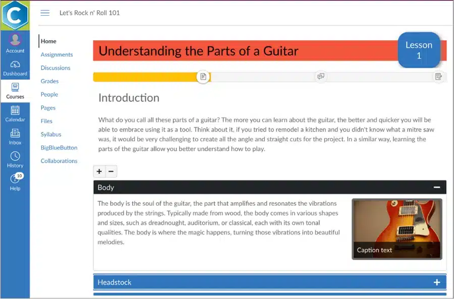
Make it easy for learners to determine where they are throughout the course. Providing elements that visually indicate progress through a set of materials can help learners feel more grounded as well as a sense of accomplishment. In the course depicted below, we can see a bar at the top of the page that tells the learners what they’ve accomplished, where they are currently, and what’s next.
Provide an easy way to get help. Like the SOS button that you might have in your car that is super easy to access when needed, learners too can benefit from a clear mechanism for requesting help when they feel lost or need guidance.
“Visual course design matters to students and faculty. The strategic use of multimedia, interactive elements, and clear navigation empowers students to engage with course content in meaningful ways.” (Clark & Mayer, 2016)
Here are some other resources you may find useful.
Do you know someone who would like to receive our Design Matters Digest? Tell them they can subscribe here.
Citations:
Sun, K.t., Lin, Y.c. & Yu, C.j. 2008. “A study on learning effect among different learning styles in a Web-based lab of science for elementary school students.” Computers & Education, 50(4), 1411-1422. Elsevier Ltd.
Clark, Ruth and Richard Mayer. 2016. “e‐Learning and the Science of Instruction: Proven Guidelines for Consumers and Designers of Multimedia Learning.” John Wiley & Sons.
© 2023 Cidi Labs, LLC All Rights Reserved

Description