A monthly newsletter bringing together research and action for accessible online course design.
Watch the recording of Accessibility Matters Live! Mythbusting: Accessible Courses Need Not Be Boring
Are accessibility myths impacting your course design practices?
Welcome to the sixth edition of Accessibility Matters Digest, where we discuss the benefits of designing accessible courses, acknowledge the complexities in that process, and highlight the research and tools that can support delivering accessible courses in Canvas. This month, we’re considering common concerns about accessible course design and separating myths from research-backed methods.
“An important reason for the low implementation in practice may be that practitioners are concerned about negative consequences of making web sites accessible. Such negative beliefs are very common among practitioners, such as making a web site accessible results in a boring, dull or aesthetically unappealing design for nondisabled users”
(Schmutz et al., 2019).
Research is clear that accessible courses are good for all learners, so once a designer or educator has moved beyond the primary myth that accessible course design is only about catering to a small number of learners, the focus shifts to the nuances in actually creating accessible courses. It’s here that a variety of concerns spring up about whether effective design practices are compatible with accessibility guidelines.
For example, if a course’s use of color is flagged as inaccessible, it can be tempting to simply remove all the color. As the issues stack up, educators and designers may scrap their creative course design for a limited or bland styling, hoping to avoid inaccessible learning experiences.
There’s no need to settle! In fact, research shows that “Web Accessibility has no negative impact on aesthetics” but instead “improves performance and perceived usability for all user groups” (Vollenwyder et. al, 2019). With a few key strategies, you can design beautiful, engaging, and accessible courses.
Let’s explore some common myths about accessible course design and how, with research-backed strategies and the right tools, it’s easy to create accessible, impactful learning experiences in Canvas:
What’s behind the myth? Without coding expertise, it’s more challenging to achieve desired layouts with the Canvas editor, compared to certain design applications and slideshow technology. Some users turn to tables for layout purposes, and others may rely on external applications or convert beautifully-designed content–such as infographics–into a PDF or image to retain styling. These practices can reduce content accessibility, especially for learners using assistive technology.
Myth, busted: Consider styling Headings in Canvas with icons to create visually appealing and organized content segments. Aligning images to the side of relevant text helps alleviate the split-attention effect (Mayer et al., 1996) while also delivering an aesthetically pleasing design. Comfortable with an easy html option? Use simple bordered columns (so you know where the columns begin and end!) instead of a table to lay out content horizontally; you’ll support mental model formation and avoid signaling that a data table is present when one is not–win, win!
DesignPLUS provides a set of features to turn your Canvas layout dreams into an accessible reality. Add and adjust columns, cards, background shapes and so much more to your Canvas content with the touch of a button–no coding required!
Myth 2: Accessible courses can’t use color or images for visual appeal.
What’s behind the myth? The use of color and images can pose a challenge when they are the only mechanisms used to convey meaning and instructional content, because not all users will be able to access that content as intended. And when text color doesn’t have enough contrast with its background color, it becomes difficult or impossible to read for many users.
Myth, busted: There’s no need to sacrifice visual appeal! A quick tip is simply to ensure the information that you’re trying to convey with color or images is also conveyed by text–whether that be in the primary content, a label accompanying the color, or alternative text or a long description for the image; multimodal learning benefits all learners! For color styling, you can use the WebAIM contrast checker to find a few favorite color combinations that meet contrast standards; reusing those combinations contributes to a more consistent design and an accessible one, too!
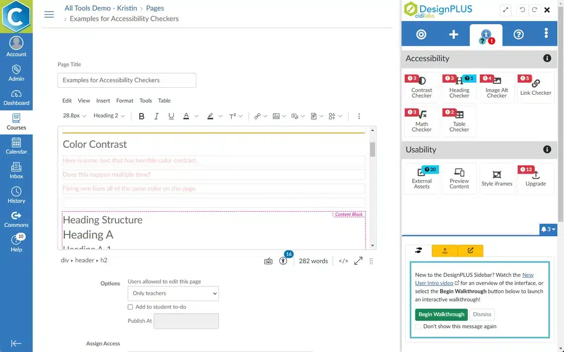
DesignPLUS Themes automatically generate colored headings in Canvas that utilize accessible combinations of your institution’s branding colors. Plus, DesignPLUS features robust accessibility checkers to help you review image alternative text at a glance, fix repeated instances of insufficient color contrast in one step, and more!
Myth 3: Accessible Canvas content can’t be interactive.
“I love being able to customize my Canvas lessons in a way that is much more accessible than trying to learn to code it from scratch.” – Rob Frederick, Instructional Teacher, Broken Arrow Public Schools
Bite-Sized Solutions
To keep the digest, well, digestible, each month we’ll deliver a bite-sized solution for a common accessibility challenge. We hope these small but mighty tips will empower you and provide momentum on your journey of developing and delivering accessible Canvas courses!
Challenge: Slideshows are so useful, yet making them accessible can be quite difficult!
Solution: With DesignPLUS, you can build a slideshow experience right inside the Canvas editor using vertical tabs with the previous and next buttons enabled. You can even apply a fullscreen option to deliver that presentation experience.
Check out the 2-minute video segment of our recent webinar that showcases this solution!
Citations:
Mayer, Richard & Bove, William & Bryman, Alexandra & Mars, Rebecca & Tapangco, Lene. (1996). When Less Is More: Meaningful Learning From Visual and Verbal Summaries of Science Textbook Lessons. Journal of Educational Psychology. 88. 64-73. 10.1037/0022-0663.88.1.64.
Schmutz, S., Sonderegger, A., & Sauer, J. (2019). Easy-to-read language in disability-friendly web sites: Effects on nondisabled users. Applied ergonomics, 74, 97-106.
Vollenwyder, B., Iten, G. H., Brühlmann, F., Opwis, K., & Mekler, E. D. (2019). Salient beliefs influencing the intention to consider Web Accessibility. Computers in Human Behavior, 92, 352-360.